a discovery of our discovery sessions

Although our creative studio is well known in the real estate development and hospitality space, you might be surprised to read we’ve worked on branding projects in a wide array of industries. Like that time we re-branded a manufacturer of industrial safety accessories [a.k.a goggles, gloves, and safety vests]. Random, right? Shout out to our awarding-winning brand, ironwear.
We’ve also worked on personal brands – that is building a brand for an entrepreneur, a coach in this case, with a very niche target audience [the award-winning brand for katie sandler].
The key that has given us the flexibility to effectively brand any business is our tried and tested Discovery Session process. For us, this is stage one. We don’t jump into brand messaging or brand design without first taking our clients through a discovery phase, which is exciting and enlightening for both us and them

In a nutshell, a Discovery Session is an in-depth and in-person meeting with all the decision-makers leading the to-be-branded project and the helium creative team. The Discovery Session marks the beginning of our brand development process and can be anywhere from a 2-hour meeting at our Fort Lauderdale studio to a multi-day, on-location discovery trip on the other side of the world. We’ve taken a day trip within Florida and even crossed the pond to London in order to experience, and profoundly understand, the culture and environment of the brands we’ll be defining

During these discovery trips, we immerse ourselves in the experience our client’s clients will be having. We love it when our clients plan out the trip itinerary, suggesting the must-see spots and activities which allow us to walk in their shoes. During this journey of discovery, we gather inspiration from each little detail we encounter. It could be a sight, a feeling, something overheard in passing – most of our iconic brands have been inspired by the creative insight gathered during these trips.

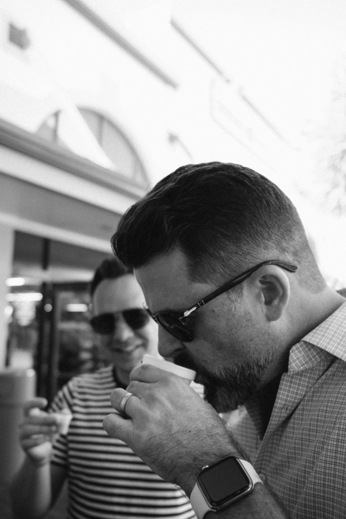

Whether or not we travel for a Discovery Session, we always take time to have a formal sit-down meeting during which we ask a list of very crucial questions that have been curated through the years to provide us with the most insight into the intention and goals for the brand. The answers we receive to these questions are the gasoline that fuels our creativity. The more backstory we receive from our clients, the better. In fact, some of our discovery meetings have been so inspiring they’ve lasted over 8 hours! When a company has a rich backstory and is self-aware, we can create a visual representation of their history through their brand.


Another component of our Discovery Sessions is having all the meeting participants fill out a S.W.O.T. Analysis. This is a diagram where they fill out the company’s strengths, weaknesses, opportunities, and perceived threats as of this moment in time. This simple, but effective marketing tool allows us to assess what makes this particular brand unique, how to leverage it, and who they’re up against. We bring up the key takeaways from the gathered S.W.O.T. forms and discuss as a team during the meeting, which always leads to new insights for our clients as they get to see their company from new perspectives.

At the end of each Discovery Session we always leave with a notebook full of juicy, creative notes, a phone full of inspiring photos, and a handful of new friends with whom we get to work with. There’s a bond that is built knowing that we understand where a company has been and where it’s going – and that we’ve taken the time to experience it as they experience it every day. For us, that is the discovery that ignites our creative spark.


Be sure to follow us on instagram or facebook for an inside look into our discovery session trips, latest projects and award winning work!

april sights + sounds

Here at the studio we’ve been busy creating brand identities, launching new websites into the world and organizing photoshoots [have you seen our latest blog?] Of course, in the background of all the work, we’ve been listening to some great music that we’re excited to share! So here it is: sights + sounds vol. III 
This is also the most fire playlist cover we’ve ever dropped. Just saying.
You can listen the full playlist on Spotify here

Ryan’s sights + sounds


Top Songs

The Joke – Brandi Carlile
Sometime Around Midnight – Airborne Toxic Event
Piano Man – Billy Joel
Stand By Me – Ben E. King
Let It Be – The Beatles
Good Thing Gone – Elle King
Happy – Julia Michaels
Anxiety – Julia Michaels
Mama’s Worried – Patty Griffin
How’s It Going to Be – Third Eye Blind
Congratulation – MGMT

Something I’m loving this month:


RISK! Storytelling
We cannot confirm or deny, but theres a rumor that Ryan has been selected to speak at RISK’s Fort Lauderdale event in May. WOOHOO!
Check out some RISK stories here

Dave’s  sights + sounds


Top Songs

Yellow – Emmit Fenn
4AM in London – Benjamin Francis Leftwich
Turnin’ Me Up – BJ The Chicago Kid
Lose My Cool – Amber Mark
Across The Room [feat. leon Bridges] – ODESZA
Golden Hour – Kacey Musgrave’s
306 – HONNE
Crying Over You – HONNE
Sweet Disposition – The Temper Trap
This Must Be The Place – Sure Sure
Floors – Abhi The Nomad, Foster Cazz
Wild –  The Japanese House

Something I’m loving this month:


The Toby’s Estate rebrand to partners coffee
I spent some time in Boston this month at the Specialty Coffee Association Expo where I saw the unveiling of this major rebrand.  It’s exciting to watch brands rollout new identities, especially when they look this good. I grabbed a ton of swag and put an order in for some coffee.
Check out the press release here


What’ are you listening to and enjoying these days? Share your sights + sounds on instagram or facebook and tag us @heliumcreative!

honored as best of show – 2 years in a row!

January of this year marked our 15-year anniversary. Yes! That’s 15 years of branding, website development, graphic design, and marketing projects that have brought upon amazing experiences and made helium creative a recognized full-service creative studio.
We are humbled that we’ve been able to stay strong for 15 years and to still be honored by the American Advertising Federation, especially the Greater Fort Lauderdale and the Palm Beaches chapter, with some of their top awards.
On March 7th, the helium crew traded in Fort Lauderdale for West Palm Beach to attend the 2019 ADDY Awards Gala at Harriet Himmel Theatre. In company of other remarkable creative agencies, we received a total 7 awards – including Best of Show for the 2nd year in a row!
Check out the full list of the winning projects.

BEST OF SHOW + GOLDdrip pop Website
Last year, drip pop’s brand and packaging design won Judge’s Choice and Gold. This year, the intricately animated and colorfully designed website won Best of Show! This truly makes drip pop an all-around award-winning brand. See more.


GOLDBad Harriet Brand Development
A Gold ADDY Award is quite fitting for this gold + black, film noir and femme fatale inspired brand: Bad Harriet. Developing the brand for this upscale bar located in Auberge Resorts’ Hotel Jerome in Aspen was truly a sinful pleasure. See more.

GOLDRevelation Design Website
Who said all florals had to be delicate? Revelation Design is a modern-day, floral and event design studio for whom we conceptualized and designed a custom e-commerce website that is equal parts romantic and edgy. See more.

SILVERParagon Website
With Paragon, a concept project developed in conjunction with renowned architecture firm, García Stromberg, we pushed the boundaries of what we consider reality and showcased the possibilities of virtual reality through an award-winning website. See more.

SILVER
EDSA Magazine Design
Design Matters is still leading the pack for most ADDY awards received throughout the years with a total of 6 since 2013. Being able to work closely with EDSA to concept and design their annual emblematic publication is truly an honor. See more.

SILVERPlant Intention Brand Development
For the creation of Plant Intention we went as far as traveling to London to meet with the inspiring founder and grasp as much of her energy to infuse into this product-driven brand. From concepting the name to developing the striking brand, we are sure this is just the first of many awards.

Want to learn how we develop these award-winning brands? Join us for an exclusive Behind the Scenes of the creation of the ADDY Best of Show winner: drip pop. We welcome you to our studio on Thursday, April 18th, from 6:30pm – 8:30pm for a conversation about how the multi-ADDY-winning brand and campaign work for drip pop came to be. Grab your tickets here.
And follow us on instagram and facebook to keep track of our future award-worthy work!


helium discusses hiring with web designer magazine

With Summer just around the corner, many college students have started applying for internships at design studios all across the country. Many of them with similar questions:  What does it take to be a good candidate? What does an agency look for in my resume? What do I need to know?
We answered those questions [and many more] in an interview we did with web designer Magazine.  Take a look at this snippet where we talked about working here at helium.

As a small agency choosing the right people to join their close-knit team is vital to get right. Christopher outlined their process for finding these rare individuals: “We always look for employees who are genuine. As a small, boutique studio personality is crucial. People who are leaders and can wear many hats, who have great values and ethics, who are conceptual thinkers and can look at the big picture are highly attractive to us.
“Talent is only a fraction of what makes someone a great fit. They have to be able to bring ideas to the table and understand how to communicate them to the team as well as the client; then have the capability to manage and execute those ideas into a viable and effective product. That’s the whole package. My best advice to anyone looking to step into the industry is to not try to impress, just be you. Be honest about your skillset and show an eagerness and willingness to learn.”
Ryan quickly interjects. “Know the basics! We get resumes all the time from designers, for example, who clearly do not understand design fundamentals. All I have to do is look at a resume or cover letter to know if someone is a right fit for our team or understands the basics. Show me you know how to layout a great resume focused on simple typography, hierarchy, readability. A well designed resume is like eye-candy. No frills. Just pure, simple, amazing layout composition. Show an agency that you get it.”

Think you have what it takes to work here? Head over to our contact page and fill out our join the team form, we’d love to hear from you!
As always, you can follow along with our team on instagram or facebook @heliumcreative.

Paragon Malibu AR/VR // helium reality


BeMeals // A Wholesome Kind of Brand

Check out the live e-blast HERE.
Let us know what you think in the comments or follow us @heliumcreative everywhere.
http://heliumcreative.com/


port 32 // making waves

creating new boating experiences
Port 32 is a marina collection based out of South Carolina with locations across the United States. Originally named Atlantic Marina Holdings, they came to us for a complete rebrand. From naming, to brand identity, messaging, and website design – we set out to create a marine experience like no other.


the challenge
Port 32 has big plans. In the next few years they aim to expand exponentially creating an elite collection of the best marinas in the United States [and perhaps beyond]. To accomplish this, they needed a solid brand that could be presented to both investors and potential clients. Their goal – to hit the market with a sleek new brand that spoke about luxury and impeccable service.


the branding basics
First things first, the name. Port 32 was inspired by the longitude and latitude coordinates of their headquarters in Charleston, NC. From there, the nautical-inspired colors drove the look + feel of the brand. Our goal was to break the mold of what a marina brand should look like. We wanted a marina that stood out against the rest and was memorable. A culture you just want to be part of.


We had tons of fun taking Port 32’s stylized brand elements, brand colors, and typography and transforming them into solid pieces of marketing. To build the online presence, we designed a single-page website for the main Port 32 – A Marina Collection brand and landing pages for their first 3 marina locations. We also conceptualized 5 email marketing templates and edited a video that shows the Port 32 lifestyle.

“We are glad we hired helium creative to re-brand our company. Their inventive designs allowed us to condense who we are and what we do into one sophisticated package. From our logo to our website designs, everything flows into one beautiful presentation. They were able to capture the essence of our company and translate it, through design, into a new and innovative brand that is helping grow our business.”

Joe H. Miller, IV
Port 32, Managing Principal

It’s no secret we love the ocean and found ourselves like a fish in water during this brand development process. We set to create a modern and upscale marina brand and we’re so happy with the result. Want to see more of Port 32? experience the full brand.

See more of our work on instagram or facebook @heliumcreative!

a wholesome kind of brand


the recipe for a bold brandThere are few instances when we’re given the opportunity to develop a brand from scratch. Without even a name in mind, the founders behind this innovative food service where customers can purchase healthy meals on-the-go came to helium in needs of the complete brand experience. You could say we branded them from soup to nuts.


the challenge
The concept behind BeMeals is to use flash freezing/fast heating technology to offer an array of nutritional and delicious entrées within preexisting establishments that wouldn’t normally offer healthy food options.
Our challenge was to create a bold brand that stood out and lead to brand recognition within the already competitive food industry.

it’s time for design explorationAfter playing with a few name options – some completely symbolic, others more emotional, and a handful food-related – BeMeals came to be as the completion of the tagline: “Be happy, be healthy, be you, be meals.” The moment we said it we knew we had a winner.
From that point forward, we jumped into logo concepting and color exploration. The logo, specifically, led the charge for the resulting brand direction.
“helium creative understood and captured the essence of the BeMeals brand, transforming a strategic analysis into a live, meaningful mark that perfectly translated the essence of what we were looking to transmit to our customers. helium’s work has provided a valuable framework to capture our innovative concept as we embark in a dialogue with our clients.”
Michael Esrubilsky, BeMeals, Founder + CEO
be happy, be healthy, be youBeMeals is serious about food, health, natural ingredients, value, and their customer. We created a brand with this mindfulness woven throughout and stayed true to the mission statement we wrote for the company at the beginning of the development process: “A culture aimed to connect people back into their life by serving real foods in real time for ­­­­real eaters.”
Experience the full brand here. And see more of our work on instagram or facebook @heliumcreative!

new client introduction // revelation design

It’s no surprise we like flowers. A few weeks at our studio and we’ll turn any non-plant lover into a fervent green thumb. As so, it shouldn’t be a surprise we were smiling ear to ear at the opportunity to rebrand Revelation Design – an Amelia Island based floral and event design studio led by floral industry artist, Brooke Raulerson.
Looking to heavily target the wedding industry, we went to work developing a brand that was the perfect mix of masculine and feminine. Inspired by architecture and unconventional floral designs, the Revelation Design brand took a life of its own. It’s the first brand for which we’ve created a secondary logo that is used behind the main logo as a pattern. We also created an emblem, stationery, packaging, a teaser website, and art directed a photoshoot.
This brand has us blooming from ear to ear!

Originally named Artistic Florist, Brooke wanted to develop a brand under the name Revelation Design that encompassed all their floral and event design capabilities – because they are so much more than just a local floral shop. Our challenge was to create a brand that reflected the sophisticated edginess of their work.
After a quick discovery trip to Amelia Island, a quaint old-Florida beach town with a mix of history and eccentricity, and a tour of their new hangar studio we translated our on-site experience to the moodboard.

Taking inspiration from details of botanicals and classic architectural structures, the mood of Revelation Design is that of curated beauty meeting organic artistry.
Positioning //Revelation Design is an award-winning floral concept and event design studio focused on curating inspired moments. From creative floral arrangements to tailored environments for any occasion, owners Brooke and Dale Raulerson lead with an emphasis on artistic vision. With mindful consideration of client goals, Revelation Design creates bespoke botanicals that inspire a space, an emotion or an experience.
Mission Statement //We seek the spark to ignite work that resonates beyond petals and stems. Revelation Design is the thread that weaves any occasion together, the finer details that strike an emotional cord. With passion that blooms from bespoke botanicals and arrangements, our love lies in executing flawlessly crafted experiences that do nothing more than inspire a space, an emotion or an experience.
Tagline //Bespoke botanicals & tailored environments


The Revelation Design logo represents a classic and timeless brand that is experienced in their craft in the floral and event design industry. A vital balance between organic images of florals and the clean lines of the wordmark evoke a contemporary design.
For the color palette, we were inspired by a contrast between masculinity and femininity, dark and light, organic and structured.

The typography for this brand is refined, yet playful with a mix of different fonts that together work in perfect unison. We also designed an emblem and hand-painted secondary logo, which act as a brand identifiers without having to use the full logo, but not taking the place of the logo altogether. The stationery package and floral shop collateral each brings an element of the brand to the forefront to not overpower by using all elements at once.

We were also super honored to art direct their bridal-inspired floral photoshoot and even our own Experience Designer, Kelly, had her moment in the limelight. See more on the behind-the-scenes of the photoshoot experience here.

See below some of the most recent collateral pieces we’ve created for Revelation Design including a folded brochure, postcard set, custom ribbon, wall graphic, and teaser website!
Check out the Revelation Design teaser website here.
Stay tuned for more of the Revelation Design brand o on instagram or facebook @heliumcreative!