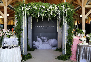
It’s no surprise we like flowers. A few weeks at our studio and we’ll turn any non-plant lover into a fervent green thumb. As so, it shouldn’t be a surprise we were smiling ear to ear at the opportunity to rebrand Revelation Design – an Amelia Island based floral and event design studio led by floral industry artist, Brooke Raulerson.
Looking to heavily target the wedding industry, we went to work developing a brand that was the perfect mix of masculine and feminine. Inspired by architecture and unconventional floral designs, the Revelation Design brand took a life of its own. It’s the first brand for which we’ve created a secondary logo that is used behind the main logo as a pattern. We also created an emblem, stationery, packaging, a teaser website, and art directed a photoshoot.
This brand has us blooming from ear to ear!
Originally named Artistic Florist, Brooke wanted to develop a brand under the name Revelation Design that encompassed all their floral and event design capabilities – because they are so much more than just a local floral shop. Our challenge was to create a brand that reflected the sophisticated edginess of their work.
After a quick discovery trip to Amelia Island, a quaint old-Florida beach town with a mix of history and eccentricity, and a tour of their new hangar studio we translated our on-site experience to the moodboard.
Taking inspiration from details of botanicals and classic architectural structures, the mood of Revelation Design is that of curated beauty meeting organic artistry.
Positioning //Revelation Design is an award-winning floral concept and event design studio focused on curating inspired moments. From creative floral arrangements to tailored environments for any occasion, owners Brooke and Dale Raulerson lead with an emphasis on artistic vision. With mindful consideration of client goals, Revelation Design creates bespoke botanicals that inspire a space, an emotion or an experience.
Mission Statement //We seek the spark to ignite work that resonates beyond petals and stems. Revelation Design is the thread that weaves any occasion together, the finer details that strike an emotional cord. With passion that blooms from bespoke botanicals and arrangements, our love lies in executing flawlessly crafted experiences that do nothing more than inspire a space, an emotion or an experience.
Tagline //Bespoke botanicals & tailored environments
The Revelation Design logo represents a classic and timeless brand that is experienced in their craft in the floral and event design industry. A vital balance between organic images of florals and the clean lines of the wordmark evoke a contemporary design.
For the color palette, we were inspired by a contrast between masculinity and femininity, dark and light, organic and structured.
The typography for this brand is refined, yet playful with a mix of different fonts that together work in perfect unison. We also designed an emblem and hand-painted secondary logo, which act as a brand identifiers without having to use the full logo, but not taking the place of the logo altogether. The stationery package and floral shop collateral each brings an element of the brand to the forefront to not overpower by using all elements at once.
We were also super honored to art direct their bridal-inspired floral photoshoot and even our own Experience Designer, Kelly, had her moment in the limelight. See more on the behind-the-scenes of the photoshoot experience here.
See below some of the most recent collateral pieces we’ve created for Revelation Design including a folded brochure, postcard set, custom ribbon, wall graphic, and teaser website!
Check out the Revelation Design teaser website here.


0 comments: