port 32 // making waves
creating new boating experiences
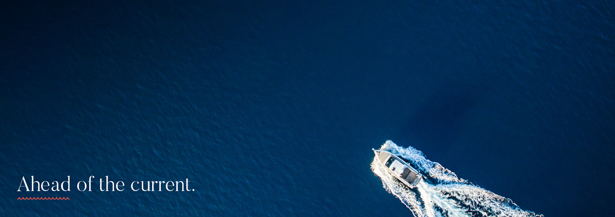
Port 32 is a marina collection based out of South Carolina with locations across the United States. Originally named Atlantic Marina Holdings, they came to us for a complete rebrand. From naming, to brand identity, messaging, and website design – we set out to create a marine experience like no other.
the challenge
Port 32 has big plans. In the next few years they aim to expand exponentially creating an elite collection of the best marinas in the United States [and perhaps beyond]. To accomplish this, they needed a solid brand that could be presented to both investors and potential clients. Their goal – to hit the market with a sleek new brand that spoke about luxury and impeccable service.
the branding basics
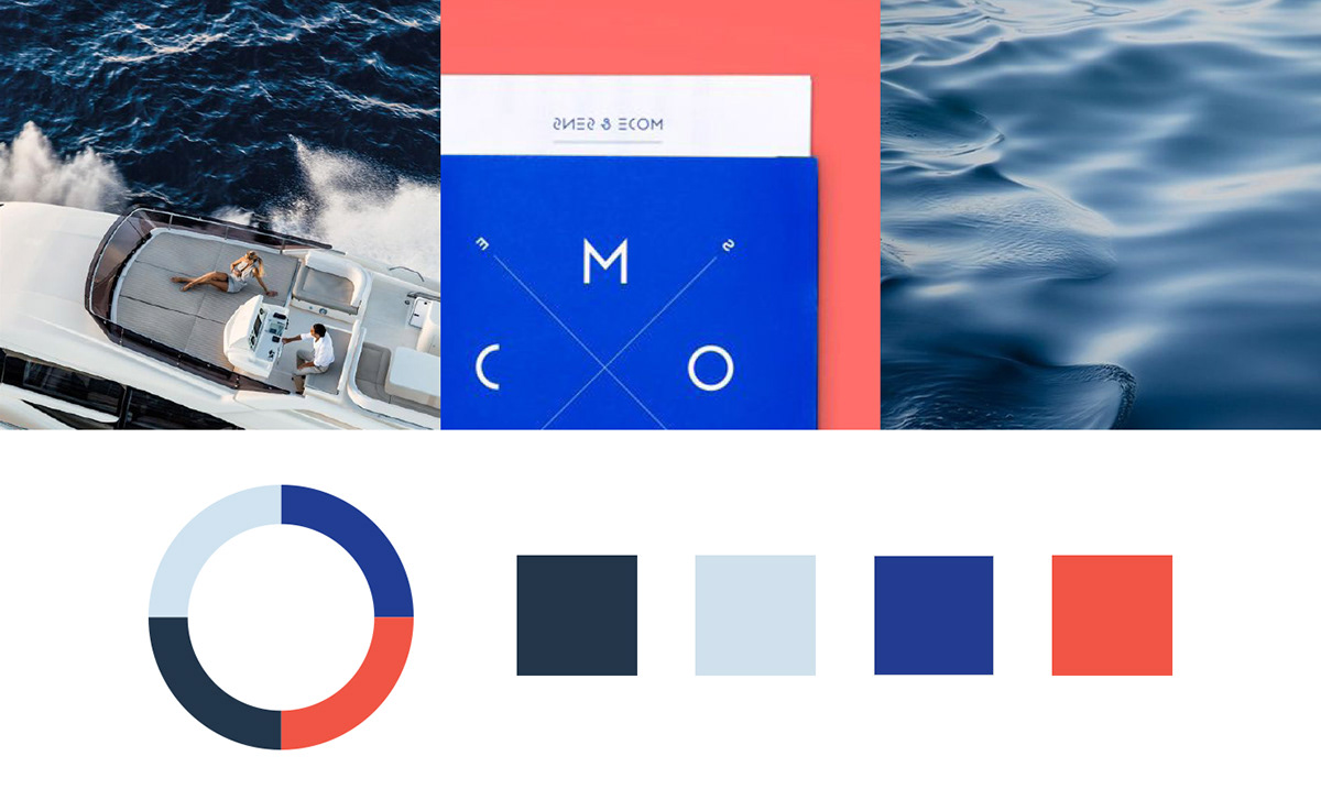
First things first, the name. Port 32 was inspired by the longitude and latitude coordinates of their headquarters in Charleston, NC. From there, the nautical-inspired colors drove the look + feel of the brand. Our goal was to break the mold of what a marina brand should look like. We wanted a marina that stood out against the rest and was memorable. A culture you just want to be part of.
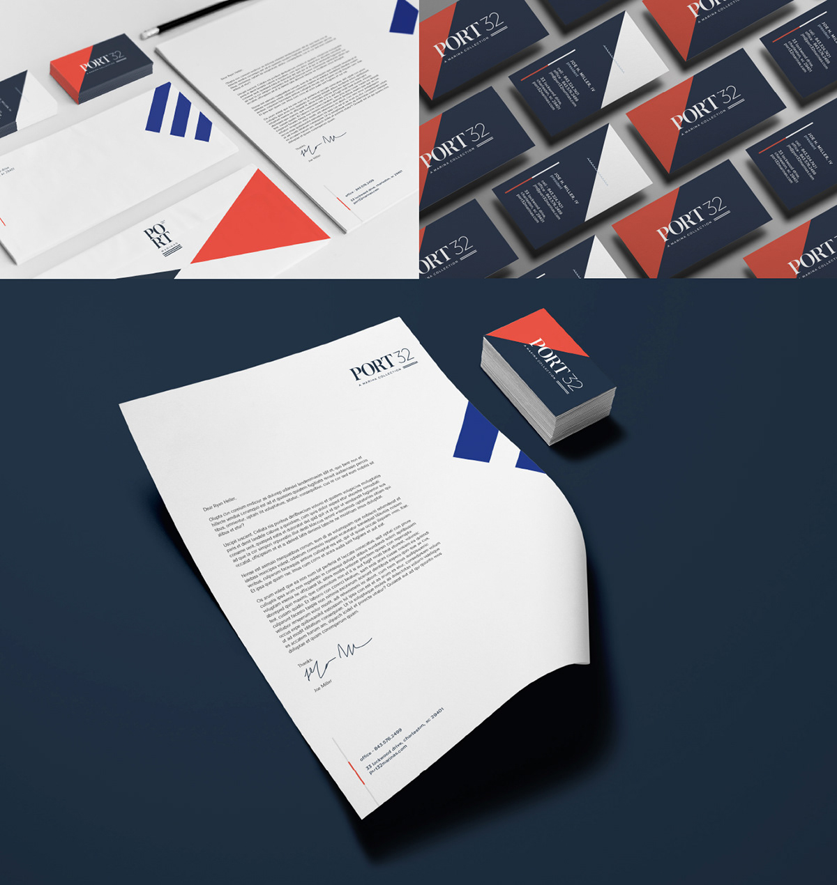
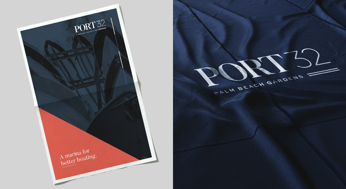
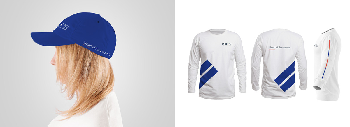
We had tons of fun taking Port 32’s stylized brand elements, brand colors, and typography and transforming them into solid pieces of marketing. To build the online presence, we designed a single-page website for the main Port 32 – A Marina Collection brand and landing pages for their first 3 marina locations. We also conceptualized 5 email marketing templates and edited a video that shows the Port 32 lifestyle.
“We are glad we hired helium creative to re-brand our company. Their inventive designs allowed us to condense who we are and what we do into one sophisticated package. From our logo to our website designs, everything flows into one beautiful presentation. They were able to capture the essence of our company and translate it, through design, into a new and innovative brand that is helping grow our business.”
Joe H. Miller, IV
Port 32, Managing Principal
It’s no secret we love the ocean and found ourselves like a fish in water during this brand development process. We set to create a modern and upscale marina brand and we’re so happy with the result. Want to see more of Port 32? experience the full brand.
See more of our work on instagram or facebook @heliumcreative!
a wholesome kind of brand
the recipe for a bold brandThere are few instances when we’re given the opportunity to develop a brand from scratch. Without even a name in mind, the founders behind this innovative food service where customers can purchase healthy meals on-the-go came to helium in needs of the complete brand experience. You could say we branded them from soup to nuts.
the challenge
The concept behind BeMeals is to use flash freezing/fast heating technology to offer an array of nutritional and delicious entrées within preexisting establishments that wouldn’t normally offer healthy food options.
The concept behind BeMeals is to use flash freezing/fast heating technology to offer an array of nutritional and delicious entrées within preexisting establishments that wouldn’t normally offer healthy food options.
Our challenge was to create a bold brand that stood out and lead to brand recognition within the already competitive food industry.
it’s time for design explorationAfter playing with a few name options – some completely symbolic, others more emotional, and a handful food-related – BeMeals came to be as the completion of the tagline: “Be happy, be healthy, be you, be meals.” The moment we said it we knew we had a winner.
From that point forward, we jumped into logo concepting and color exploration. The logo, specifically, led the charge for the resulting brand direction.
“helium creative understood and captured the essence of the BeMeals brand, transforming a strategic analysis into a live, meaningful mark that perfectly translated the essence of what we were looking to transmit to our customers. helium’s work has provided a valuable framework to capture our innovative concept as we embark in a dialogue with our clients.”
Michael Esrubilsky, BeMeals, Founder + CEO
be happy, be healthy, be youBeMeals is serious about food, health, natural ingredients, value, and their customer. We created a brand with this mindfulness woven throughout and stayed true to the mission statement we wrote for the company at the beginning of the development process: “A culture aimed to connect people back into their life by serving real foods in real time for real eaters.”
new client introduction // revelation design
It’s no surprise we like flowers. A few weeks at our studio and we’ll turn any non-plant lover into a fervent green thumb. As so, it shouldn’t be a surprise we were smiling ear to ear at the opportunity to rebrand Revelation Design – an Amelia Island based floral and event design studio led by floral industry artist, Brooke Raulerson.
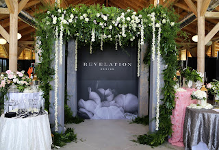
Looking to heavily target the wedding industry, we went to work developing a brand that was the perfect mix of masculine and feminine. Inspired by architecture and unconventional floral designs, the Revelation Design brand took a life of its own. It’s the first brand for which we’ve created a secondary logo that is used behind the main logo as a pattern. We also created an emblem, stationery, packaging, a teaser website, and art directed a photoshoot.
This brand has us blooming from ear to ear!
Originally named Artistic Florist, Brooke wanted to develop a brand under the name Revelation Design that encompassed all their floral and event design capabilities – because they are so much more than just a local floral shop. Our challenge was to create a brand that reflected the sophisticated edginess of their work.
After a quick discovery trip to Amelia Island, a quaint old-Florida beach town with a mix of history and eccentricity, and a tour of their new hangar studio we translated our on-site experience to the moodboard.
Taking inspiration from details of botanicals and classic architectural structures, the mood of Revelation Design is that of curated beauty meeting organic artistry.
Positioning //Revelation Design is an award-winning floral concept and event design studio focused on curating inspired moments. From creative floral arrangements to tailored environments for any occasion, owners Brooke and Dale Raulerson lead with an emphasis on artistic vision. With mindful consideration of client goals, Revelation Design creates bespoke botanicals that inspire a space, an emotion or an experience.
Mission Statement //We seek the spark to ignite work that resonates beyond petals and stems. Revelation Design is the thread that weaves any occasion together, the finer details that strike an emotional cord. With passion that blooms from bespoke botanicals and arrangements, our love lies in executing flawlessly crafted experiences that do nothing more than inspire a space, an emotion or an experience.
Tagline //Bespoke botanicals & tailored environments
The Revelation Design logo represents a classic and timeless brand that is experienced in their craft in the floral and event design industry. A vital balance between organic images of florals and the clean lines of the wordmark evoke a contemporary design.
For the color palette, we were inspired by a contrast between masculinity and femininity, dark and light, organic and structured.
The typography for this brand is refined, yet playful with a mix of different fonts that together work in perfect unison. We also designed an emblem and hand-painted secondary logo, which act as a brand identifiers without having to use the full logo, but not taking the place of the logo altogether. The stationery package and floral shop collateral each brings an element of the brand to the forefront to not overpower by using all elements at once.
We were also super honored to art direct their bridal-inspired floral photoshoot and even our own Experience Designer, Kelly, had her moment in the limelight. See more on the behind-the-scenes of the photoshoot experience here.
See below some of the most recent collateral pieces we’ve created for Revelation Design including a folded brochure, postcard set, custom ribbon, wall graphic, and teaser website!
Check out the Revelation Design teaser website here.
sweeping the creative awards season // muse + hermes creative awards
Can this award season get any better?! Us folks at helium have been sweeping the design, advertising, and creative awards scene thanks to our recent brand development, graphic design, and web design + development work.
Following our magical night at the local ADDYs [The American Advertising Awards] where we took home 14 awards, including Best of Show, we found out our work also won 5 ADDYs at the District level and 1 ADDY at the National level. That’s HUGE! The work we did for drip pop is now a National-Award-Winning brand!
In addition to all the good ADDY news, back in April we found out we won 7 muse creative awards and 7 hermes creative awards. Yep! Another 14 awards!
Check out the winning brand + design work!
MUSE CREATIVE AWARDSPLATINUM
akoya // Brand Launch Campaign
drip pop // Brand, Packaging + Splash Page
plnthouse // Brand Development + Restaurant Collateral
helium creative // holiday card
bemeals // Brand Development
port 32 // Brand Development, Stationery + Swag
revelation design // Brand Development + Stationery
HERMES CREATIVE AWARDSPLATINUM
akoya // Brand + Teaser Campaign
drip pop // Naming, Brand, Packaging + Web
bemeals // Naming, Brand + Stationery
edsa design matters 2017 // Magazine Design
HERMES CREATIVE AWARDSGOLD
helium creative // holiday card
HERMES CREATIVE AWARDSHONORABLE MENTION
port 32 // Naming, Brand, Stationery + Swag
revelation design // Brand + Stationery
There’s still a handful of design, advertising, print, web, and creative awards to be announced this year. Give us a shout out of good luck on instagram or facebook @heliumcreative!
14 addy awards to celebrate our 14th year
The helium team attended The American Advertising Awards [ADDYs] this past March 8th and we are proud to announce our accomplishments! All 14 of them! A huge thanks to our amazing clients, design team, web team + our trusted partners for their collective hard work, dedication, and attention to detail. Such an honor to have been recognized for our immersive brand experiences with 14 ADDYs on our 14th year anniversary.
Take a look at the winning projects.
BEST OF SHOW + BEST OF CROSS PLATFORM + GOLDVISTABLUE SINGER ISLAND
[full brochure + website]
[full brochure + website]
The full brochure and full website we designed and produced for Palm Beaches luxury real estate property, VistaBlue Singer Island, is not only one of our most successful brands [from 1 sale to over 70% sold in a little over 1 year] – it’s also the proud winner of the Best in Show Award, Best of Cross Platform Award, and a Gold ADDY. What an honor to receive some of the most prestigious awards of the night!
JUDGE’S CHOICE + GOLDDRIP POP
[brand + packaging]
[brand + packaging]
One of our more exciting and recent brands, drip pop, took home the Judge’s Choice Award and a Gold ADDY. And this is only the beginning. We have a feeling this brand is going to sweep the 2018 advertising, web, and design award season.
GOLDAKOYA
[brand + collateral]
[brand + collateral]
Akoya became a first for us – developing the brand and real estate marketing campaign for a development project nestled among neatly manicured golf courses, championship tennis courts, and multimillion dollar clubhouses. We’ve done beach and we’ve done city, but now we conquered luxury country club living and it’s taken home the Gold.
GOLDPLNTHOUSE
[brand + collateral]
[brand + collateral]
Another Gold winner is plnthouse, a Matthew Kenney plant-based restaurant and café located inside the iconic 1 Hotel & Homes South Beach. Yummy eats = yummy brand.
GOLD5 PARK
[brand development]
[brand development]
Our branding work for 5 PARK, a North Miami real estate development in an urban setting, not only played a part in getting the project approved by the city, it also won a Gold ADDY. Two for two!
GOLDHAAWI
[brand development]
[brand development]
We’ve always known we are a fashionable bunch! And our Gold ADDY for charitable fashion, handbag + accessories brand, HAAWI, proves it!
GOLDREVELATION DESIGN
[brand development]
[brand development]
We can’t say much about this upcoming brand that’s just begun to blossom except, well, we won big for our brand development work!
GOLDPORT 32
[brand + stationery]
[brand + stationery]
Another upcoming brand for which we can’t say much, except maybe we should change the colors to GOLD, blue, and coral. LOL
SILVEREDSA // DESIGN MATTERS 2017
[magazine design]
[magazine design]
We’re elated the 2017 issue of Design Matters, the annual magazine of global landscape architecture firm EDSA, was awarded another ADDY award. That’s 5 ADDYs for Design Matters since 2013. Wow!
SILVERBEMEALS
[brand development]
[brand development]
BeMeals is a self-operating POS where customers can purchase frozen wholesome meals on the go. From naming to brand development, this Silver ADDY winner is one of our recent projects that we’re still drooling over.
SILVERHELIUM CREATIVE HOLIDAY CARD
[card, invitation, announcement]
[card, invitation, announcement]
For 2017, we decided to dedicate our holiday card to the theme of recipes that remind us of our hometown. Those recipes turned into an art project, which turned into a Silver ADDY award-winning holiday card.
2 ‘Best Of,’ 1 Judge’s Choice, 8 gold, and 3 silver awards later [plus a night of catching up with wonderful advertising + design peers] – we left with our hands full and smiles on our faces. Thanks to the ADDY association for the recognition and thanks to each of our clients for believing in us.
Port 32 // a marina collection
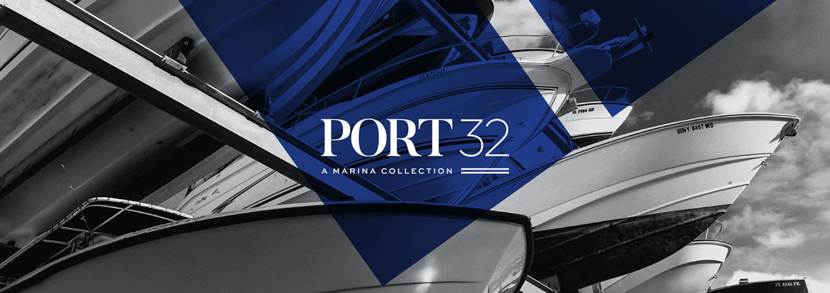
Port 32 is a marina collection based out of South Carolina, but with marina locations across the United States. Originally named Atlantic Marina Holdings, they came to us to rebrand their company as they planned to expand exponentially. They wanted to hit the market with a sleek new brand that spoke about luxury and impeccable service.
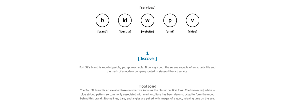
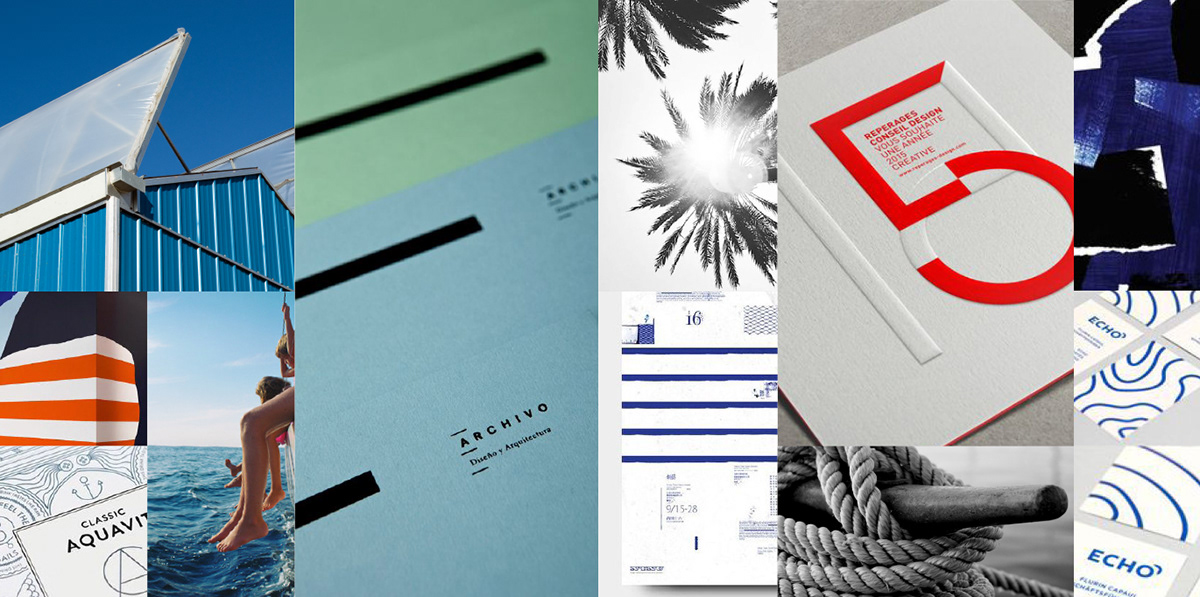
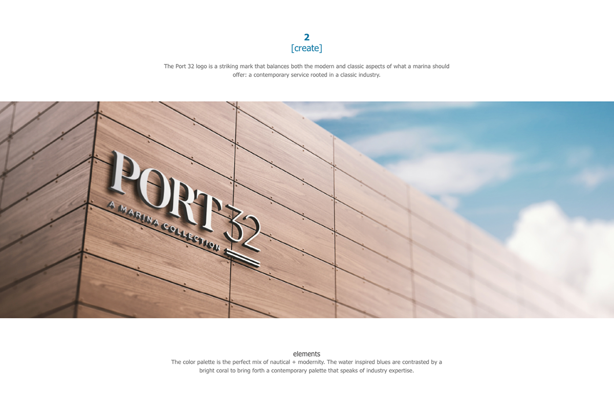
The name Port 32 was inspired by the longitude and latitude coordinates of their headquarters in Charleston. From there, the nautical-inspired colors drove the look + feel of the brand. Our goal was to break the mold of what a marina brand should look like. We wanted a marina that stood out against the rest and was memorable. A culture you just want to be part of.


Thanks for checking out our work! To see more visit http://www.heliumcreative.com or follow @heliumcreative on Instagram.
Subscribe to:
Comments (Atom)
About Me
- helium creative
- helium creative is a branding + design studio. We create dynamic, personified brands for clientele who value an in-depth collaborative approach. With a fine-arts emphasis on design, synergistic client relationships, and a tailored branding process, helium creative offers unconventional solutions for impactful brand experiences.
Powered by Blogger.




0 comments: