
Do you need aerial drone videos for your real estate property? Call the top real estate drone photography company helium creative in Fort Lauderdale

A Midsummer Day’s Dream
We’re in the middle of hot, sticky Florida summer and we’re loving
it! At least today, when we’re in the cool comfort of our homey creative
studio in the heart of Fort Lauderdale Beach. Summer vibes have been
showing up in our most recent work. If you haven’t seen our July
newsletter, catch up on it HERE and take in all those bright-as-day colors that have inspired some of our most recent brands.
Diving deeper into our summer-inspired inspiration, check out some of the imagery that’s been filling up both our Pinterest board and graphic designer hearts.

blue state of mind
Okay. Okay. So we can never steer to far away from blue. What can we say? It’s our brand color and what kind of branding agency would we be if we didn’t stay cohesive? All kinds of blue tones pop up in our summer inspo as they remind us of the ocean that’s only a few blocks away from our studio. Funny thing is, we are approached by many water-industry clients who love how we uniquely incorporate water themes into our brands.

bright + shocking
Being bland is boring! If you’re going to use color, why be subtle. Bring out that Pantone swatch book – we’re painting the town neon!

graphic hand-lettering
Now that the delicate spring months are past us, we can see an influence of stronger natural elements seeping into typography and hand-lettering trends. Bold and dramatic hand-lettering samples kept popping up in our inspiration boards as a sign that we’re daring to take a delicate craft and turn up the volume.


texture
Most of us spend many summer days outdoors and there’s nowhere better to find a variety of interesting textures than outside! The use of textures inspire us creatively from a branding + design standpoint as they show how color can come to life by looking at the highlights and shadows created by light reflecting on a textured surface. Textures also evoke feelings and branding is nothing more than evoking one huge big feeling of satisfaction.

What’s inspiring you this season? Share your inspo on Instagram or Facebook and tag us @heliumcreative!
Diving deeper into our summer-inspired inspiration, check out some of the imagery that’s been filling up both our Pinterest board and graphic designer hearts.
blue state of mind
Okay. Okay. So we can never steer to far away from blue. What can we say? It’s our brand color and what kind of branding agency would we be if we didn’t stay cohesive? All kinds of blue tones pop up in our summer inspo as they remind us of the ocean that’s only a few blocks away from our studio. Funny thing is, we are approached by many water-industry clients who love how we uniquely incorporate water themes into our brands.
bright + shocking
Being bland is boring! If you’re going to use color, why be subtle. Bring out that Pantone swatch book – we’re painting the town neon!
graphic hand-lettering
Now that the delicate spring months are past us, we can see an influence of stronger natural elements seeping into typography and hand-lettering trends. Bold and dramatic hand-lettering samples kept popping up in our inspiration boards as a sign that we’re daring to take a delicate craft and turn up the volume.
texture
Most of us spend many summer days outdoors and there’s nowhere better to find a variety of interesting textures than outside! The use of textures inspire us creatively from a branding + design standpoint as they show how color can come to life by looking at the highlights and shadows created by light reflecting on a textured surface. Textures also evoke feelings and branding is nothing more than evoking one huge big feeling of satisfaction.
What’s inspiring you this season? Share your inspo on Instagram or Facebook and tag us @heliumcreative!
Gimme My Papers, Man
There are times when one of us, and this seriously happens to every
single person on our creative studio, there are times when one of us is
handed a business card, a brochure, a fill-in-the-blank
something-or-other and it’s like a pause button is pressed. We could be
in the middle of a conversation and pick up a menu, and in that moment
the tactile connection of skin to paper can ignite a special momentary
lustful experience that leaves the other person, the innocent bystander
at the other end of this hypothetical conversation, to wonder what the
hell is going on. Because there I am [Ryan] – or Kelly, or Chris, or
Enid – menu in hand, mid-conversation, gently caressing the paper with a
romantic, slightly creepy caress. A sliver of drool falls from the
corner of my mouth, eyes are a distant spiral. Ah, yes, the love of
paper. A designer and their play things.

We get loads of awesome paper sample books from various vendors, courtesy of our favorite paper rep and paper doll, Zarie Lorow, from Mac Papers [she’s the best!]. We’ve got metal baskets filled with Mohawk, Neenah, Mac, French, the list goes on. Paper books are an awesome resource not only for paper selections when we have print projects, but also design inspiration.
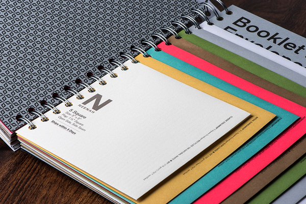


Mohawk puts out their impeccably designed MAKER magazine, which utilizes the most current paper samples and printing techniques. It takes will power and desk shackles to keep us from running to our clients screaming, “LET”S DO THIS!” And even then, even then we gnaw off our own ankle to break free! As a design agency in Fort Lauderdale, it’s so important to get inspiration from work across the nation. You know – thing outside of the Florida bubble.


With new paper textures, colors and weights released each year, the list of opportunities runneth over. In our digital world, it’s refreshing to receive tangible marketing and branded materials that can easily make a huge impact. Intricate brochures, stationery, direct mail, magazines – whatever the project, the right paper selection will absolutely further communicate the brand experience.
Check out some of our favorite client pieces where we were able to play with some great paper options.


What’s your favorite print piece? Let us know on instagram or facebook @heliumcreative!
We get loads of awesome paper sample books from various vendors, courtesy of our favorite paper rep and paper doll, Zarie Lorow, from Mac Papers [she’s the best!]. We’ve got metal baskets filled with Mohawk, Neenah, Mac, French, the list goes on. Paper books are an awesome resource not only for paper selections when we have print projects, but also design inspiration.
Mohawk puts out their impeccably designed MAKER magazine, which utilizes the most current paper samples and printing techniques. It takes will power and desk shackles to keep us from running to our clients screaming, “LET”S DO THIS!” And even then, even then we gnaw off our own ankle to break free! As a design agency in Fort Lauderdale, it’s so important to get inspiration from work across the nation. You know – thing outside of the Florida bubble.
With new paper textures, colors and weights released each year, the list of opportunities runneth over. In our digital world, it’s refreshing to receive tangible marketing and branded materials that can easily make a huge impact. Intricate brochures, stationery, direct mail, magazines – whatever the project, the right paper selection will absolutely further communicate the brand experience.
Check out some of our favorite client pieces where we were able to play with some great paper options.
What’s your favorite print piece? Let us know on instagram or facebook @heliumcreative!
A Very helium Easter
A few weeks ago the helium team jumped on a flight to
Chris’ hometown – Lancaster, Pennsylvania. Home of the Amish and the
capital of the United States for 1 day [there’s a fun history fact for
you], over the course of Easter weekend, helium creative painted the town blue.

Bright and early Thursday morning we took at 6am flight into Baltimore and then drove through the most amazing open fields, farms, and green hills on our way to downtown Lancaster – our new home for the next 5 days.

The feel of downtown Lancaster is indescribable. A mixture of really – REALLY – nice people and urban coolness you would associate with a city like Portland or Seattle. Our inspiration buckets were overflowing. Every corner brought inspiration from older city elements as well as modern storefronts + store signage. Basically, every corner was a photo opportunity.


The small business industry is admirable in Lancaster. There’s a true love for supporting the under dog and the under dog is mighty + proud. Great branding and design elements are sprinkled throughout the streets leaving you with the feeling you’ve been transported into the mind of a really talented artist who created this magical imaginary city.


 Drive only 10 minutes out of downtown and you’ll find a different kind
of beauty. Silence. Endless horizons. Stillness. And nature.


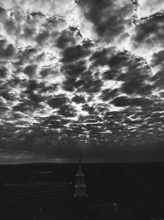


We can’t write about Lancaster without writing about the culture. Everyone is SO nice! The kind of nice that makes you take a moment to think if you’re being nice enough back? Taking in all that Lancaster goodness had the helium team in even higher spirits than usual – and we’re usually a pretty chipper group! We spent some quality time eating to our heart’s content with Chris’ awesome family and we even had a haunted, nighttime Easter egg hunt. You know us, we’ll make anything creative.

Easter morning had an early morning wake-up call at 4am to make it to Bird-In-Hand for an awe-inspiring hot air balloon ride over the countryside.


After a long Easter weekend and one short nap – it was time to say good bye.

Until next time Lancaster, see you soon!

Let us know what city inspires you on instagram or facebook @heliumcreative!

Bright and early Thursday morning we took at 6am flight into Baltimore and then drove through the most amazing open fields, farms, and green hills on our way to downtown Lancaster – our new home for the next 5 days.

The feel of downtown Lancaster is indescribable. A mixture of really – REALLY – nice people and urban coolness you would associate with a city like Portland or Seattle. Our inspiration buckets were overflowing. Every corner brought inspiration from older city elements as well as modern storefronts + store signage. Basically, every corner was a photo opportunity.


The small business industry is admirable in Lancaster. There’s a true love for supporting the under dog and the under dog is mighty + proud. Great branding and design elements are sprinkled throughout the streets leaving you with the feeling you’ve been transported into the mind of a really talented artist who created this magical imaginary city.


We can’t write about Lancaster without writing about the culture. Everyone is SO nice! The kind of nice that makes you take a moment to think if you’re being nice enough back? Taking in all that Lancaster goodness had the helium team in even higher spirits than usual – and we’re usually a pretty chipper group! We spent some quality time eating to our heart’s content with Chris’ awesome family and we even had a haunted, nighttime Easter egg hunt. You know us, we’ll make anything creative.

Easter morning had an early morning wake-up call at 4am to make it to Bird-In-Hand for an awe-inspiring hot air balloon ride over the countryside.


After a long Easter weekend and one short nap – it was time to say good bye.

Until next time Lancaster, see you soon!

Let us know what city inspires you on instagram or facebook @heliumcreative!
new client introduction // plnthouse
Nobody can say helium can’t hold a secret. We’ve
been bursting at the seams for months to tell you about one of our
latest brand development projects and now – finally – we get to share it
all!
Remember our Inspired Staycation at 1 Hotel South Beach back in October 2016? Well, that trip was inspired by the fact that we were brought on to brand from scratch a new plant-based, fast-casual café located inside the iconic 1 Hotel & Homes South Beach. The restaurant – developed by renowned plant-based chef Matthew Kenney – had our creative neurons bouncing in excitement to create brand that was equal parts earthy and yummy.

The plnthouse brand finds inspiration first and foremost from the name itself. With a name that stems from its core foundation as a plant-based restaurant, much inspiration is found in organic and natural elements used in the kitchen. From ingredients to artfully presented meals, a refined and creative style dictates the mood throughout the plnthouse brand experience.

To differentiate plnthouse from the existing and future competition, we established what makes the brand unique and defined its brand position:
Positioning //
For the wellness lover and the foodie at heart – plnthouse offers a feel-good, healthy fast-casual culinary experience overlooking the ocean waves and white sand beaches of South Beach.
The cuisine presents vibrant, nutrient rich options for guests looking to energize their mornings with breakfast bowls, smoothies, and finely crafted coffee. Lunch offerings include light, nourishing dishes that activate the palette to explore a unique variety of flavors.
With world leading plant-based chef Matthew Kenney at the helm, plnthouse is at home in 1 Hotel South Beach, fusing together two innovative brands that value wellness, sustainability and the mission to change the way we view healthy food.
Mission Statement //
A fresh perspective on wellness culture that connects people to a cutting-edge culinary experience where they can feel good, eat good and be in good company.
Brand Keywords //
Innovative
Progressive and unique, offering a cutting-edge culinary experience
Fresh
Great, quality ingredients meets a new perspective on wellness cuisine
Plant-Based
100% plant-based dining
Sensory
Dining experiences that delight, educate and inspire using all senses – from food to design, color to presentation, smell to taste
Shared
Experiences with other like-minded people in a community environment
Creative
An inspired dining experience enriched by a keen focus to detail, design, innovation and presentation
Relaxed
An easy, carefree pace where a customer feels comfortable and at ease
Connected
Bringing people together with plant-based food and a culture of wellness
Tagline //
Feel good, eat good, be in good company.
[logo process + logo]
The plnthouse logo is a clean, typographic mark. Linear cut-outs represent the organic, plant-inspired nature of the restaurant – acting as abstract roots or vines weaving through the name. Wrapping up the logo, an identifier “the good kitchen” was added in the main brand color.

The brand colors are inspired by the origins of plnthouse – the organic, natural world. Greens, gray, and white are the primary brand colors with shades of gray and neutral tones acting as a background palette in photography and other material.

Food portraits in monochromatic brand colors Lime, Olive, Gray + White are used to further brand recognition. The pattern used to create the cuts within the plnthouse logo is also used as an abstract, organic texture and a main brand identifier.

Then came the part we were most excited about, designing the restaurant deliverables. Take a look at how the brand all came together:


Subscribe to:
Posts (Atom)
About Me
- helium creative
- helium creative is a branding + design studio. We create dynamic, personified brands for clientele who value an in-depth collaborative approach. With a fine-arts emphasis on design, synergistic client relationships, and a tailored branding process, helium creative offers unconventional solutions for impactful brand experiences.