an unusually cool south florida spring
To our surprise, the weather in South Florida at the end of March has been chilly. You read that right. It’s Spring and we’re still wearing our sweaters [paired with flip flops, of course]. YAY!
In honor of this wacky, but delightful, weather we’ve put together what is inspiring us as graphic designers, artists, and brand developers as we enter the Spring 2018 season.
when in florida…
Yes, we’re in the Sunshine State. The state where the license plates have these really tacky oranges on them. But that doesn’t mean we love citrus colors. We usually lean more towards blues [shocker] and neutral palettes that are inspired by the luxury industry and the ocean lifestyle of many of our clients. However, every once in a while, we see one of our brands really making a mark in a bold yellow or orange. Looks like we’ll be seeing more citrus-inspired design coming out of our computers in the upcoming months.
feeling leafy
One step into our Fort Lauderdale branding studio and you’ll know there’s one thing we love – a lot. Plants!! There’s at least one plant or piece of greenery on each desk or designated area in the studio. We even have a plant wall. It’s been exciting to see leaf-inspired design and textures pop-up in our Pinterest boards. It’s so fun to see how different leaves can spark completely different brand looks.
black + white texture
There’s never a shortage of black + white inspiration in our moodboards. The stark contrast of these two colors always serves as the good basis to see if a logo, pattern, icon, or brand element will work in any circumstance. Add texture to the mix and you have a piece of art before you even start working it into the brand.
Brand, Packaging + Website Development // drip pop
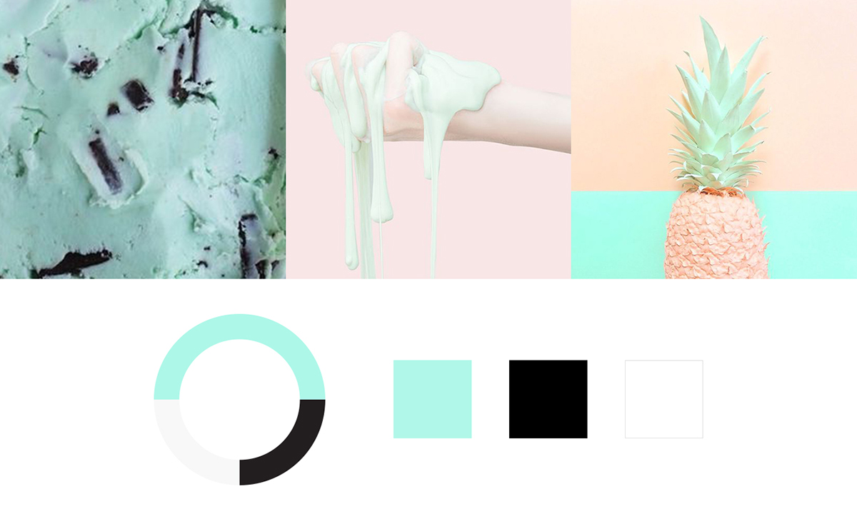
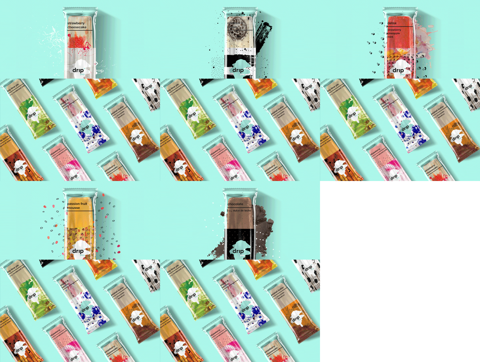
Boy, we are excited with this branding project: drip pop. Originated in South America, the now named drip pop came to us for a complete new name and brand overhaul. Previously named FijiPop, five young Bolivian entrepreneurs came to helium creative to help market their delicious lavapops [frozen popsicles filled with creamy fillings] to the United States. They were looking for a creative studio that saw the brand as a piece of art.
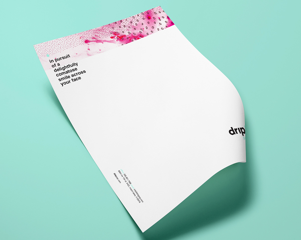
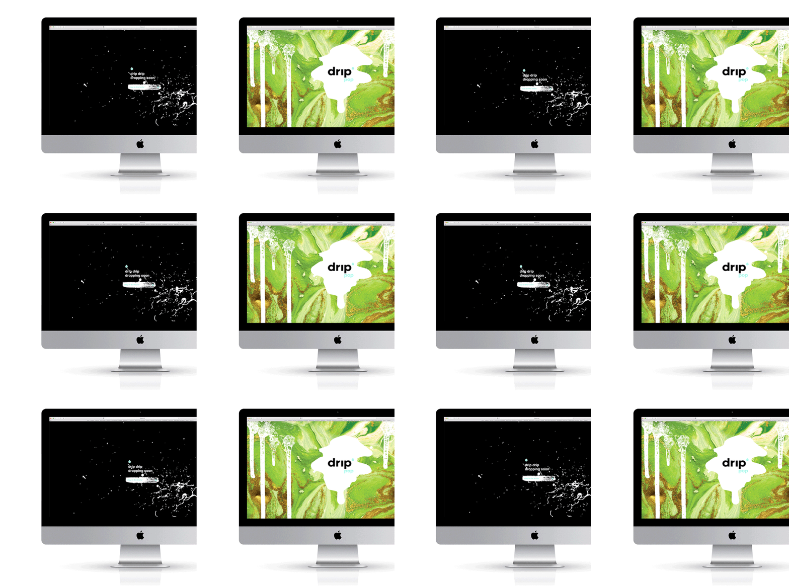
Inspired by the flavors, sensations, colors, ingredients, and story behind the lavapops – we set off to create a brand that was full of vibrancy and playfulness. We named them drip pop and from there we developed the brand messaging, brand identity, pop packaging, supermarket box packaging, splash page, and full website.
Thanks for checking out our work! To see more visit http://www.heliumcreative.com or follow @heliumcreative on Instagram.
Subscribe to:
Posts (Atom)
About Me
- helium creative
- helium creative is a branding + design studio. We create dynamic, personified brands for clientele who value an in-depth collaborative approach. With a fine-arts emphasis on design, synergistic client relationships, and a tailored branding process, helium creative offers unconventional solutions for impactful brand experiences.
Powered by Blogger.