what’s inspiring us: february edition

As creatives we’re constantly saving visual references we find online, taking pictures or creating our own art. We wrote about feeding our creative monster a few weeks ago, so if you’d like to hear more about our inspiration process, check out that post.

This month our mood board has a water theme going on.


From watercolor walls to hot springs to the ocean, we have water on the brain. We are working with a couple clients whose branding involves water so maybe we’re subconsciously brainstorming for their campaigns.


Hand lettering always inspires us. Whether it’s loopy calligraphy or more rudimentary writing, hand lettering lends a human element that draws us into the design.


Of course we had to include music in our inspiration – we listen to music all day in the studio. Astor Piazzolla is a famous Argentinean tango composer and musician and his live album The Central Park Concert is one of Enid’s favorites. She loves to listen to it while strategizing.

We are always saving inspirational quotes and self-help author Brene Brown’s statement about creativity is one of our favorites [the graphic is pretty awesome too]. “Creativity is straddling the tension, leaning into the discomfort, and finding your way through the dark.” It’s about making your own way, even though it may be uncomfortable and you’re unsure what others may think. If everyone colored inside the lines, the world would be pretty boring. We’re here to make it interesting!

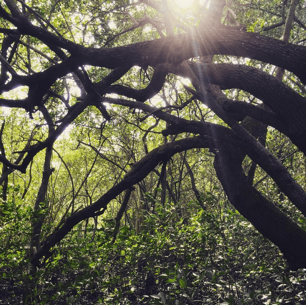
Spending time in nature always invigorates us. Whether it’s on the water, in the woods or a park, nature’s beauty never ceases to amaze. Not only can natural elements inspire design, novel experiences also stimulate the brain creating new neural connections.


Spirals are a trending design element in architecture at the moment. We love the modern/rustic feel of the interior staircase on our mood board. Even better is one of Coconut Grove’s latest buildings – it’s amazing!


The spiral staircase at the new Barney’s Chelsea flagship store is swoon worthy.


Love this shot of it by Nicole Cohen of Sketch 42.


It’s amazing how the staircase perfectly mimics a nautilus shell.


The sculpture below looks like a wave and a nautilus shell had a baby.


It’ll be interesting to see if spiral elements start to appear in graphic design. Thanks for checking out our inspiration this month. Tag us on Instagram or Facebook, @heliumcreative, and let us know what’s inspiring you!

feeding the creative monster

Let’s face it, this bunch of extremely creative + artistic people we call helium creative can be easily distracted. From song lyrics heard on our office radio, to people walking on the sidewalk outside our office windows or falling into the rabbit hole of the latest installment of “the most perfect Instagram account ever,” our attention is constantly diverted from one sparkly object to the next. To the outside world we might seem crazy, but lying underneath all the crazy distractions is inspiration and that’s what we feed off.

We’re sure you’ve heard the phrase “inspiration is everywhere.” It’s not a cliché, it’s very, very true. Snoop on the Photos app of any creative person’s iPhone [yes, we all have iPhones] and you’ll find a jackpot of pics from our daily life that inspire us one way or another.


Inspiration comes in a variety of ways, shapes, and forms and almost always comes when least expected. When you work in the creative field, you’re constantly using your trunk full of accumulated artistic knowledge. Mixing that typography you saw on a poster in a coffee shop with the geometric lines you saw on a building lit up at night, and giving it all a twist to make it unique and something you can call your creation. Before you know it, that trunk needs to be filled again and out into the world you go seeking new inspiration-filled distractions.


There is a rare neurological condition called synesthesia in which two or more of the five senses cross paths in your brain and people can actually hear colors or taste letters. Many synesthetes who have been interviewed say they wouldn’t trade their medical condition for the world. The manner in which they experience their surroundings and daily interactions is beautifully heightened and, as creatives, we understand where they’re coming from. Being able to take in what you can capture through your 5 senses – to see beyond what simply meets the eye and hear the hidden meanings of a favorite song – and to turn that into a brand experience is exhilarating.

Our creativity is like a hungry little monster deep inside of us that needs to be fed constantly. And we’re happy to feed it. Social media platforms like Pinterest, Instagram, Behance, and Dribbble are our friends – endless sources of inspiration that leave us in awe of what can be done in the design and branding industry. However, it is important to remember to look in the most unexpected places for those treasures that turn into instant sparks of genius. You might call us hoarders, but we save baskets full of random magazine clippings, uniquely shaped leaves, and even empty candle jars in the hopes of sparking an idea for the next amazing design.


Go explore, be distracted. Feed the monster. And tell us all about what you find @heliumcreative on Instagram or Facebook!

the magic behind the curtain: managing the creative process

Ever wonder how the helium team works their magic to bring you branding and design goodness? Here’s a quick glimpse into our project management process.

It all starts with…you, actually. We’re very lucky to have a group of clients we love working with and there’s always an excitement that ensues when we receive an email that starts with “Hey guys, we need your help”. helium to the rescue! All it takes is a few project details to get our wheels turning on how we can bring your idea to life.

Whether big or small, from an existing or new client, all our projects go through our resident Project Manager, Enid. She might have an uncommon name, but our clients get to know it pretty well as she serves as point-of-contact for most communications. She’s also the human half of our trustworthy project management app, Asana.

Staying organized is by far one of the most important factors of successfully meeting deadlines with an end product you are proud to share. Asana lets us divide every project into easy-to-handle subtasks, it keeps track of everyone’s progress, and gives us a place to have all communications regarding a certain topic in one easy-to-access place.


Other factors that affect the success of meeting deadlines: timely and productive feedback from clients along with knowing when to stop over-complicating things to death! And, of course, there’s every possible form of keeping track of time. From shared iCal accounts to physical desktop calendars, being able to visualize the timeline is an important step to staying on track.

Planning our work backwards from the deadline, we lay out a timeline with internal goals for each step of the process. Time must be left for brainstorming, sketching, sitting back and staring at your work, digitizing your sketches onto the computer, sitting back again and staring at it, working a little bit more on it, and eventually letting it settle in overnight and coming back to it with fresh eyes.


A lead designer, either Ryan or Kelly, is assigned to each project, but collaboration is a huge part of how the magic happens. Bouncing off ideas and cross-examining one another’s work plays a big role in the design process and the whole team pitches in with their fair share of opinions.


At this stage of the process, Dropbox plays a crucial roll in staying organized and on time. We all share a business Dropbox account that gives us access to edit the same working file from inside or outside the office. We honestly can’t remember life B.D. [Before Dropbox].

Once we have product we are absolutely in LOVE with, we prepare the first proof for the client. The power of constructive and well-thought-out feedback is at most times underestimated. We welcome our clients to be part of the process and listen to their thoughts attentively – then again, no one knows your business as well as you. Best-case scenario, which is most of the time for us, we get approval on the first proof. Not-so-best-case scenario, we go through a few rounds of tweaking the final details before handing off the baby, a.k.a the final files, to its proud adoptive parents.

From beginning to end, there you have it – the helium project management process all rolled up into a pretty little blog post for your enjoyment.

Let us know if you have a project you want us to work on @heliumcreative on Instagram or Facebook.

a very helium holiday

What is a very helium holiday, you ask? It’s nonstop Christmas music, homemade peppermint sweet treats, a silver + blue-themed tree topped with Pee-wee Herman, and, of course, handcrafted greetings. We absolutely love the holiday cards Kelly designed for helium this year and thought you would enjoy a little behind the scenes peek at their creation.

Naturally, the process started with a some notebook doodling, which led to a sweet winter scene accompanied by a simple hand-written message. Kelly originally thought about hand-painting the scene on each card and then realized that was a whole lot of crazy. Luckily, Lumi.com makes great custom rubber stamps. With the whir of a scanner and a few quick clicks we had our very own holiday winter wonderland stamp AND an accompanying logo stamp.

3041HEL_01


3041HEL_02


3041HEL_03


3041HEL_04


3041HEL_05


3041HEL_06

Like a little elf, Kelly got to work assembling the components of each greeting card – a silver card base, topped with kraft card stock, and the final navy layer with the stamped design and messaging. To wrap it all up, each card was mailed out in a silver envelope with an appropriately themed snowflake postage stamp!

3041HEL_07


3041HEL_08


3041HEL_09


3041HEL_10

We just love creating thoughtful, handcrafted greetings!

The helium team wishes you and yours a very special Holiday.

Let us know if you love our cards as much as we do @heliumcreative on Instagram, Twitter, and Facebook!

the user experience in real life

DIRT is a soon to open, fine food served fast dining experience in South Beach. It’s a farm-to-counter eatery and wellness bar combining fresh, great-tasting food with health, convenience, and simplicity. DIRT came to helium for full brand development and we were psyched to tackle a restaurant branding project. We had the opportunity to name the concept, coin the tag line “Eat Clean,” and design the marketing materials, signage and, a first for us, packaging. You can get behind-the-scenes details on the brand development process on our work page. Now, the topic du jour is how brand elements impact the user experience in real life.
Being a fast, casual eatery, DIRT has the potential to become the third place for some people. The go-to breakfast spot before work or during lunch, the place where everyone knows your name. Like the bar Cheers from the 90’s sitcom, but the health food version with cold pressed juices and kale salads instead of Boston’s finest lager and chicken wings. The point is people will see the branded elements on a regular basis, even carrying the snacks and beverages with them.

http://www.heliumcreative.com/wp-content/uploads/2015/11/dirt_cold_cup.jpg

 http://www.heliumcreative.com/wp-content/uploads/2015/11/Screen-Shot-2015-11-10-at-1.21.48-PM.png

The eatery’s branding elements have to be something the public identifies with at every point of contact. The DIRT-branded coffee they purchase and make at home is part of their daily experience. The packaging greets them first thing in the morning as they start their day.

http://www.heliumcreative.com/wp-content/uploads/2015/11/Screen-Shot-2015-11-10-at-5.39.02-PM.png

http://www.heliumcreative.com/wp-content/uploads/2015/11/Screen-Shot-2015-11-10-at-5.40.40-PM.png

Employees proudly wear uniforms bearing the DIRT logo, which has also been etched into custom wood burned nametags.

 http://www.heliumcreative.com/wp-content/uploads/2015/11/Screen-Shot-2015-11-12-at-6.26.58-PM.png http://www.heliumcreative.com/wp-content/uploads/2015/11/Screen-Shot-2015-11-10-at-1.23.59-PM.png

If DIRT is your go-to breakfast, lunch or dinner spot, you’ll be seeing those t-shirts on the regular. For this reason we knew the logo had to be simple in aesthetic, yet bold in presence.

http://www.heliumcreative.com/wp-content/uploads/2015/11/Screen-Shot-2015-11-10-at-1.27.28-PM.png

The hand-drawn icons we created have been used not only on all of the packaging, but have also been brought to life in the form of copper wire sculptures that will hold table numbers.


http://www.heliumcreative.com/wp-content/uploads/2015/11/ColdCups.jpg

 http://www.heliumcreative.com/wp-content/uploads/2015/11/Screen-Shot-2015-11-10-at-1.21.03-PM.png

Overall, branding for a restaurant has been more about creating a real life user experience, which was an amazing opportunity!


http://www.heliumcreative.com/wp-content/uploads/2015/11/Cyclewallmockup.jpg

We’d love to hear your thoughts! Let us know on Facebook, Instagram or Twitter by tagging @heliumcreative. 😉

those who inspire us: living pattern

We love talking to other artists to learn about their process and what inspires their work. There’s something fascinating about people who are constantly creating. Not long ago we came across Jenny Kiker’s [a.k.a @livingpattern] work online while doing inspiration research. It was a beautifully shaded painting of a tropical leaf that caught our eye.

Screen Shot 2015-10-13 at 4.28.39 PM

We decided to check out Jenny’s Instagram feed and were immersed in an amazing world of nature, plants, and paintings. We clicked on image after image of beautifully styled paintings of cacti, tropical leaves, barnacles, butterflies and found ourselves wanting to learn more about the artist.

Screen Shot 2015-10-13 at 5.18.20 PM


It turns out Jenny lives in West Palm Beach about an hour from our studio and her partner Chris went to high school with Ryan, our Art Director. Talk about a small world! We contacted Jenny to see if she would like to be featured on our blog to share her work with all of you. Check out our conversation below.
hc: Tell us a little about yourself and your company, Living Pattern.

LP: I am a traditional artist who focuses on flora and fauna using watercolor and ink. I sell original artwork. Prints and textiles coming soon!

hc: It’s obvious your inspiration is nature. How do you continually find new elements?

LP: I grow most of my inspiration myself. My studio gets great morning light and it is an indoor greenhouse. Recently, I’ve been working from a collection of photographs taken at Monet’s garden in France. And of course, I go out in nature to find it myself!


Screen Shot 2015-10-23 at 9.13.59 AM

hc: We saw one of your recent Instagram posts was a picture of the largest cicada species on earth that you had ordered. We thought it was so cool that you had ordered an actual specimen. Is this something you do on a regular basis? Why?

LP: Yes, I order all kinds of reference if I can’t find it locally. I have developed quite the collection of cacti from our favorite nursery Amelia’s in Lake Worth. I strongly believe in completely surrounding yourself with your inspiration.

hc: How much time do you spend creating your artwork vs. managing other aspects of your business?

LP: I’d say 70/30, creating art vs. shipping, emailing, social media, accounting. Chris, my partner, handles my graphic design and web work. It’s amazing to have a symbiotic relationship!

hc: You have an amazing Instagram following. What do you attribute that to?

LP: I am very engaged with my audience, they are amazing and keep me inspired! Photography is very important, I always have the tripod out and wait for the perfect lighting. I love styling too, a consistent feed is a must!

hc: Our work is in the branding and marketing world and we could potentially use your artwork as digital illustrations in our designs for clients. Is that something you would consider or do you prefer that your creations remain as individual works of art? There’s no wrong answer here. We’re just curious how you feel about that. Every person is different.

LP: I really appreciate the aura of an original piece of art and art being displayed as art.

hc: How do you think custom art can distinguish a brand?

LP: For me, the art is the brand. To elaborate on the previous question, using it as digital illustrations would imply that it represents a business, but it is important to me that Living Pattern art only represents itself.

hc: What advice would you give to young artists who are looking for a way to create a business around their art?

LP: Go make! Then get ready for failure and learn how to move on until you find just the thing that works.

hc: And most importantly, what’s your studio music playlist? LOL We listen to music all day in the studio so we had to throw that in there.

LP: I love love a nice thunder storm playlist. When it’s music, I’m listening to the RHCP… haha everyone knows my obsession.

It was great talking to you Jenny! Thanks so much for chatting with us.

Check Jenny out on Instagram @livingpattern and, of course, us @heliumcreative. 😉

#heliumlovesbrand – artifact uprising

Artifact Uprising is a company we’ve had a crush on since discovering them in February. They are an internet-based company that creates beautiful, tangible products for your digital photos. Your images are printed on thick, matte card stock that can be displayed with or without a frame. The thick card stock is just so delicious.

Artifact Uprising Logo FINAL


Screen Shot 2015-09-24 at 2.42.15 PM


Screen Shot 2015-09-24 at 2.41.56 PM copy


And the photo books are works of art. Meticulously bound, filled with 100% recycled, matte finish paper.


Screen Shot 2015-09-24 at 2.46.07 PM


After visiting their website we fell even more in love with the brand. The clean design, the imagery, the language, the dedication to storytelling and their audience engagement had us reading their website in detail for more time than we care to admit.

The website features an idea gallery where they share products people have made and posted to Instagram. It’s not only inspiration for future clients, but they’re giving people an opportunity to show off their creations, which makes them feel special. The gallery is also an amazing social media marketing tactic, because people are hashtagging #ArtifactUprising for the chance to be featured.


Screen Shot 2015-09-24 at 2.45.08 PM


Another genius social media marketing move is the TellOn category of the Artifact Uprising blog. It’s a curated gallery of inspiring photos selected weekly from their Instagram #TellOn. The campaign stems from the belief that everyone has a story to tell, a story that inspires possibility.
Their brand statement and core values, the heart of a well-defined brand, are cohesive and inspiring.

The Artifact Uprising Manifesto
ARTIFACT UPRISING // inspired by the disappearing beauty
of the tangible / bettered by a community of inspired
storytellers / driven by the belief everyone has a story
to tell. Tell On.

Our [Artifact] Core Values
CREATIVITY / for all things, endless possibility. for every story, endless ways to tell it.

COMMUNITY / we seek to cultivate a community of inspired storytellers – of movers, shakers, do-ers, designers, creatives, artists, thinkers, joy-makers. we believe in the power of community to ignite creativity.

LEAVE A LEGACY / we believe in the story that is archived for future generations. we believe in moving stories off our computers…and into our lives.
THE POWER OF ONE / to create art. and change the world.

PASSION / without it, we are nothing.

ENVIRONMENTAL RESPONSIBILITY / we strive to be kind stewards to mama earth and her happy forest. we are committed to using environmentally responsible papers and are always seeking ways to minimize our impact on the outdoors – a playground that shapes so much of who we are.

AUTHENTICITY / in all things. in our communication. in our company. in the transparency of our supply chain. in our own story.

When crafting core values for a company we always consider the history and how each word relates to the culture. Artifact Uprising is a great example of how a company can embody their core values. In fact I could illustrate how they meet each one of their values, but I won’t bore you with that. The most obvious is their commitment to environmental responsibility. All of their products are printed on 100% recycled papers and the wood products are made from reclaimed mountain beetle pine wood, which is otherwise considered waste.

So to wrap things up, Artifact Uprising is this month’s #heliumlovesbrand feature, because they have fantastic products, an inspiring voice, well formed brand statements and they engage with their audience in an incredibly authentic way through the power of story.

We’d love to hear about your favorite brands or your brand story, just #heliumlovesbrand and follow @heliumcreative on Instagram, Facebook + Twitter!