Boy, are we excited with one of our most recent
branding projects: drip pop. Originated in South America, the now named drip pop came to us for a complete new name and brand overhaul. Previously named FijiPop, five young Bolivian entrepreneurs came to helium creative to help market their delicious lavapops [frozen popsicles filled with creamy fillings] to the United States. They were looking for a creative studio that saw the brand as a piece of art.
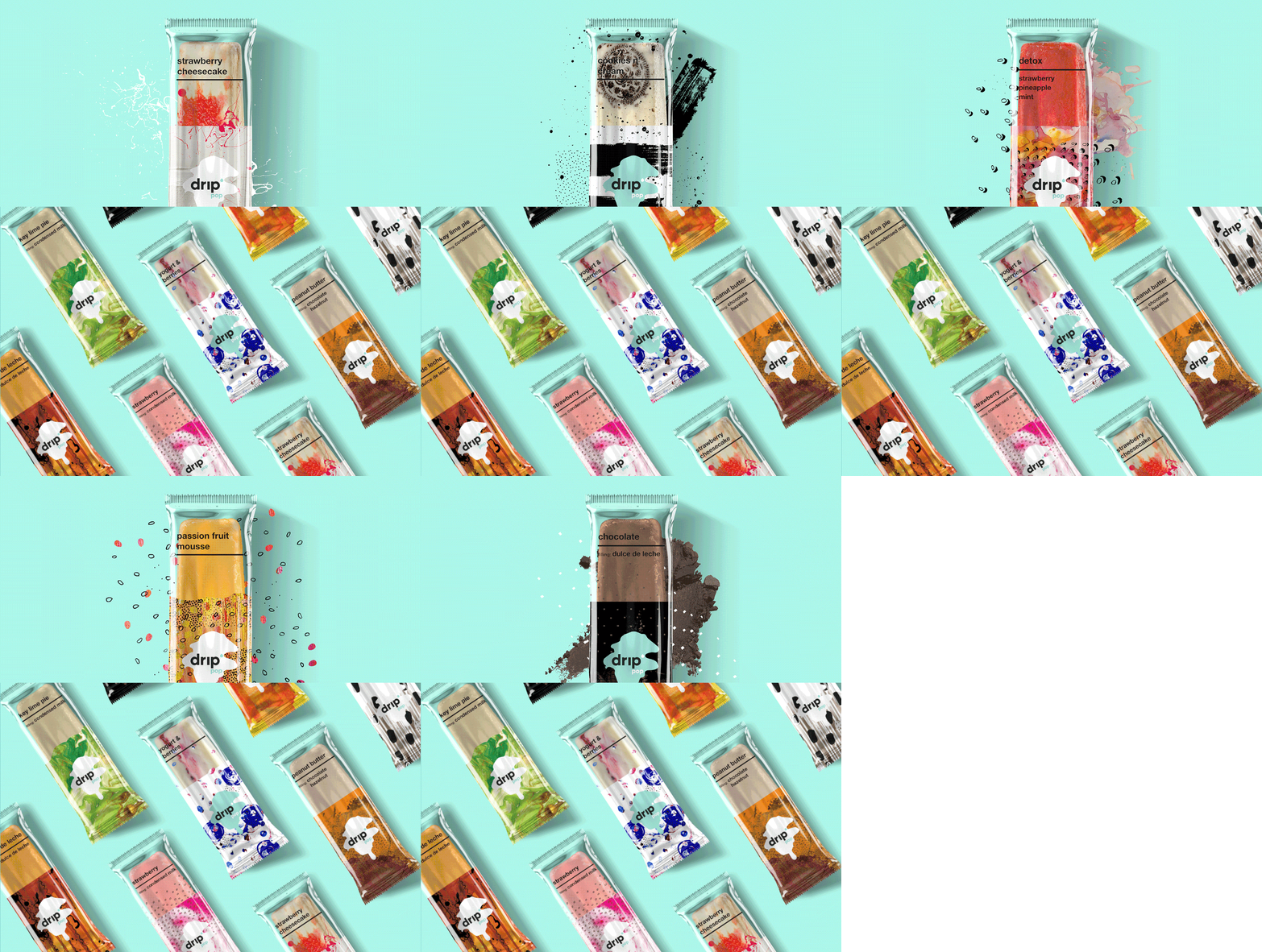
Inspired by the flavors, sensations, colors, ingredients, and story behind the lavapops – we set off to create a brand that was full of vibrancy and playfulness. We named them drip pop and from there we developed the brand messaging, brand identity, pop packaging, supermarket box packaging, splash page, and we’re currently working on the full website.
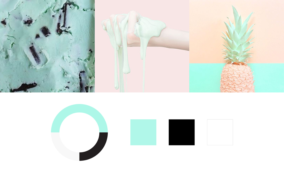
The drip pop brand is inspired by indulgent flavors and, above all, artistry. There is an artisanal hand behind each lavapop and we wanted to convey that throughout the brand. The drip pop brand is bright and cheery. It’s the feeling of being swept into a world of delicious treats and sweets. If drip was a person, they would be described as ‘The Happy Artist.’
Before we could illustrate the brand visuals for drip pop, we had to develop the brand’s personality and define its core purpose.
Positioning //
For the consumer with an eye for trendy treats and a hankering for cold, sweet indulgences, drip pop is the handcrafted anti-popsicle. A lavapop focused on fresh, organic ingredients and decadent fillings, drip pop is void of any artificial fillers or additives. Unlike competitors, drip pop utilizes a method that allows for only 10% air per lavapop, resulting in a rich texture packed with natural flavor.
Mission Statement //
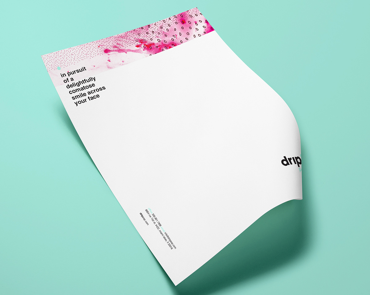
At the gooey heart of each drip pop is a drool-worthy, handcrafted experience that satisfies every ravenous little sweet tooth and pesky craving in pursuit of a delightfully comatose smile across your face.
Tagline //
The oh so good pop
Brand Keywords //
Artisanal
Our products are always handcrafted with love for consistent, outstanding quality, and a creative culinary pursuit to provide new, exciting products for our customer.
Transparency
We are 100% candid with our customers 100% of the time so all can enjoy every mouth-watering bite knowing it’s made with love and an honest consideration to nutrition.
Satisfaction
We offer a wide variety of flavors and combinations to satisfy our customers with indulgent treats just as diverse as they are, so every palate is pleased.
Quality
Innovation, artisanship, and only the finest ingredients ensure our products are always delicious, always inspired, and always good for you.
Natural
Only fresh, whole fruits, decadent fillings, and natural flavors craft every lavapop without the use of preservatives, additives, or colorings.
Innovative
Thoughtfully built on traditional methods, artistic vision and modern freezing methods, drip pop crafts rich and inspired lavapops with 60% less air than our competitors.
The drip pop logo is clean, modern, and simple. With such a decadent product, it was important to create a typographic logo that created balance. A touch of quirkiness was added with the drop at the end of the wordmark to hint at the playfulness of the brand.
The drip pop color palette is inspired by the sense of freshness and modernism communicated throughout the brand. Mint acts as the main brand and accent color, while white and stark black ground the palette to create the balance between lightheartedness and quality.
This branding project brought out the kid in all of us. Dessert is always fun, especially when it’s a frozen dessert meant to be enjoyed on hot summer days. For drip we had the opportunity to play with food both in real life and on the computer. From an actual melting lavapop we created a vector illustration used to further the drip identity.
Hand-drawn patterns that portray ingredients are added to photographs of rich textures to represent the vibrant colors found within the lavapops themselves and help make the packaging unique pieces of art.
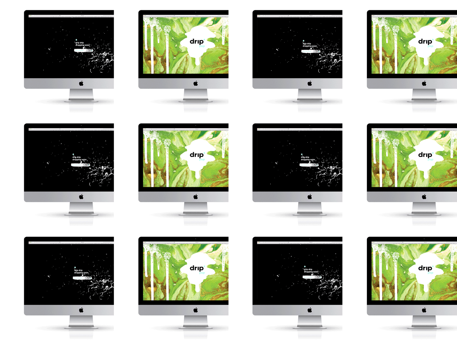
While drip pop gears up to hit the U.S. market with a pop [get it? get it?], we encouraged them to start gathering an email list via a simple, but captivating splash page. You gotta’ check this out. The animations really showcase the playfulness of the brand:
drippop.com
Stay tuned for the full drip pop website. It’s going to blow your mind. We’re not holding back with this one!
Does this brand make you want to go bonkers for ice cream? Let us know on instagram or facebook @heliumcreative!









0 comments: