Daily Thoughts From A Designer

Ever wonder what designers think about on a daily basis? We talked to our very own designers and asked them to write down thoughts that crossed their minds during the day. Not only do they come up with creative ideas for projects, but in that process they also come across some thoughts about paper options, food and that dreaded “spinning pinwheel of death.” Here’s what we’ve collected so far:

1 // NEED COFFEE NOW.That priceless brown liquid is more valuable than water at this branding studio. It’s what keeps our brains going. 

2 // Where did I save that picture?
9 out of 10 times…on your desktop or in that scary Downloads folder with over 1,000 files you haven’t sorted through in 5 years.

3 // Should we choose this uncoated or this uncoated paper?
Because gloss or matte are NEVER an option.

4 // What font is that?
This is probably one of the most-asked questions of any graphic designer. Because no, no 2 fonts were created equal.
     
5 // Oh, you want your logo to be bigger…?
The answer is NO. It’s already 4.5 inches wide.


6 // Is it lunch time yet?
FOOD. The only thing better than coffee.  


7 // How long have I been sitting here for?
Once you get into the designing groove, you don’t want to lose it. So when you start loosing sensation in your limbs, get that tingling sensation of lost circulation, get those early signs of carpal tunnel. You know it’s time to get up and move, but you just can’t. You’ll loose your groove!!!

8 // Go on Pinterest.
The solution for every inspiration block.

9 // It’s not black, it’s charcoal.
         

10 // They want to use Helvetica/Calibri/Arial… Really?
You might as well twist that knife a little more into our delicate creative hearts.

11 // YES, LOVE IT!
#yas

12 // UGH, HATE IT!
Ugh. Nevermind. I don’t like it anymore.

13 // The. Pinwheel. Of. Death!!

14 // Ooh! Instagram post inspiration!

This usually starts when one of us finds a new AH-MAZING account on Instagram and shares it with the others. Which leads to 15 minutes of drooling over said account.

15 // Is it 6pm already?
Let’s be truthful. Creatives go, go, go until they’re burnt out for the day. Creativity comes in bursts and not always fits into a Monday to Friday, 9-5 schedule. It might be a Sunday afternoon and you’ll find any of us clicking away at our computer with freshly found inspiration. So, on any given weekday, when 5:55pm rolls around, those last 5 minutes of the day feel like an eternity to go out into the world and gather more inspiration.

As a designer, what are some thoughts that cross your mind while you work? Let us know on instagram or facebook @heliumcreative!

0 comments:

New Client Introduction // 5 PARK

Urban [or urban living] has definitely been a buzzword in recent years. We live + work in Fort Lauderdale, a sleepy beach town turned sprawling urban city, and we frequently develop brands who are poised to succeed in leading cities across the nation.

Just imagine our faces when we were approached by an upcoming mixed-use urban development in North Miami to conceptualize the project name as well as create the full brand experience. Excited, to say the least.


Since the project offers 5 main lifestyle components [Social, Professional, Recreational, Entertainment + Wellness], we saw a unique opportunity to use brand positioning, color + imagery to help visually define and identify a new take on city living. In one of the first meetings with the developers, we presented a variety of names that played on focusing on these 5 lifestyles. The name, 5 PARK, organically came out of the discussion as it highlighted the lifestyles and also the property’s close proximity to some of South Florida’s most popular nature parks. A tagline was also coined, which summed it all: The Nature of Connection.


Millennials, textures, style, and the connection to nature inspire the overall 5 PARK brand. The moodboard we put together for the brand is sleek, modern, bold. The combination of natural textures and vivid elements in design create a contemporary and urban aesthetic.


Before we could cement the brand visuals for 5 PARK, we developed the brand’s personality and defined its core purpose.
Positioning //
Connected to the best of South Florida while also delivering its own rich urban lifestyle, 5 PARK is both a destination and a catalyst for the future of city living. Here, residents have access to all they need with a vibrant retail, dining, and entertainment district located right outside their front doors. 5 PARK stands on the edge of metropolitan life with close proximity to Miami and Fort Lauderdale, while being surrounded by city parks and urban energy. Only a short distance from major travel routes, 5 PARK ensures a steady flow of energy and possibility as North Miami Beach’s future capital of progress.
Mission Statement //
Inspired by progress and built from vision, 5 PARK is a step forward in sophisticated urban living that includes more than just chic, stylish residences – but also a smart approach to delivering lifestyles that are connected to social, professional, entertainment, recreational and wellness opportunities that stimulate our community. 
Brand Keywords //
Progressive
Forward-thinking, a positive break from the traditional
Urban
Downtown atmosphere with style and activity
Connected
Close to major points of interest, parks, beaches, and also a destination in itself
Vibrant
Inspiring, positive, multi-dimensional
Innovative
One of the first properties of its kind in the immediate area
Energy
A “vibe” that is always “on” and always inviting
On-Track
In step with what modern life demands/also integrates railway feature
Possibility
The idea that this property is “the right place at the right time”
Accessible
Both in the sense of location, but also in the sense of value and convenience
Catalyst
Something that becomes the basis for other things, actions, events, or developments
The 5 PARK logo is a play on the 5 lifestyles that are connected to the project. A simplistic and modern mix of icon and typography aims to elevate the brand’s visual communication. The logo is simplistic and strikes as a catalyst for possibility.

 Logo exploration.


The brand colors are inspired by bright, bold, and edgy photography. While black and white serve as primary colors for typography, Magenta, Violet, Turquoise, Cobalt + Orange are the primary brand colors with coordinating tones in background imagery and other material.


Each of the 5 brand color represents a 5 PARK lifestyle component: Social, Professional, Recreational, Entertainment + Wellness.


The end product for this stage with 5 PARK was the delivery of the Brand Guidelines. What we usually call around the studio ‘the brand book’, the PDF shows the ins and outs of the brand voice, brand usage, and visual direction. The guidelines also delve into the suggested photography art direction from product shots to editorial.

 We can’t wait to start designing the rest of the brand deliverables.

Love this brand? Let us know on instagram or facebook @heliumcreative!

0 comments:

Real Estate Drone videography Company in Miami or Fort Lauderdale

Do you need aerial drone videos for your real estate property? Call the top real estate drone photography company helium creative in Fort Lauderdale


0 comments:

A Midsummer Day’s Dream

We’re in the middle of hot, sticky Florida summer and we’re loving it! At least today, when we’re in the cool comfort of our homey creative studio in the heart of Fort Lauderdale Beach. Summer vibes have been showing up in our most recent work. If you haven’t seen our July newsletter, catch up on it HERE and take in all those bright-as-day colors that have inspired some of our most recent brands.

Diving deeper into our summer-inspired inspiration, check out some of the imagery that’s been filling up both our Pinterest board and graphic designer hearts.


blue state of mind
Okay. Okay. So we can never steer to far away from blue. What can we say? It’s our brand color and what kind of branding agency would we be if we didn’t stay cohesive? All kinds of blue tones pop up in our summer inspo as they remind us of the ocean that’s only a few blocks away from our studio. Funny thing is, we are approached by many water-industry clients who love how we uniquely incorporate water themes into our brands.


bright + shocking
Being bland is boring! If you’re going to use color, why be subtle. Bring out that Pantone swatch book – we’re painting the town neon!


graphic hand-lettering
Now that the delicate spring months are past us, we can see an influence of stronger natural elements seeping into typography and hand-lettering trends. Bold and dramatic hand-lettering samples kept popping up in our inspiration boards as a sign that we’re daring to take a delicate craft and turn up the volume.


texture
Most of us spend many summer days outdoors and there’s nowhere better to find a variety of interesting textures than outside! The use of textures inspire us creatively from a branding + design standpoint as they show how color can come to life by looking at the highlights and shadows created by light reflecting on a textured surface. Textures also evoke feelings and branding is nothing more than evoking one huge big feeling of satisfaction.


What’s inspiring you this season? Share your inspo on Instagram or Facebook and tag us @heliumcreative!

0 comments:

Gimme My Papers, Man

There are times when one of us, and this seriously happens to every single person on our creative studio, there are times when one of us is handed a business card, a brochure, a fill-in-the-blank something-or-other and it’s like a pause button is pressed. We could be in the middle of a conversation and pick up a menu, and in that moment the tactile connection of skin to paper can ignite a special momentary lustful experience that leaves the other person, the innocent bystander at the other end of this hypothetical conversation, to wonder what the hell is going on. Because there I am [Ryan] – or Kelly, or Chris, or Enid – menu in hand, mid-conversation, gently caressing the paper with a romantic, slightly creepy caress. A sliver of drool falls from the corner of my mouth, eyes are a distant spiral. Ah, yes, the love of paper. A designer and their play things.


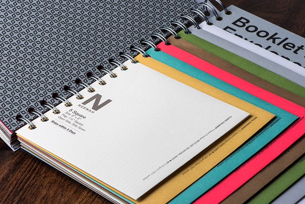
We get loads of awesome paper sample books from various vendors, courtesy of our favorite paper rep and paper doll, Zarie Lorow, from Mac Papers [she’s the best!]. We’ve got metal baskets filled with Mohawk, Neenah, Mac, French, the list goes on. Paper books are an awesome resource not only for paper selections when we have print projects, but also design inspiration.


Mohawk puts out their impeccably designed MAKER magazine, which utilizes the most current paper samples and printing techniques. It takes will power and desk shackles to keep us from running to our clients screaming, “LET”S DO THIS!” And even then, even then we gnaw off our own ankle to break free! As a design agency in Fort Lauderdale, it’s so important to get inspiration from work across the nation. You know – thing outside of the Florida bubble.


With new paper textures, colors and weights released each year, the list of opportunities runneth over. In our digital world, it’s refreshing to receive tangible marketing and branded materials that can easily make a huge impact. Intricate brochures, stationery, direct mail, magazines – whatever the project, the right paper selection will absolutely further communicate the brand experience.
Check out some of our favorite client pieces where we were able to play with some great paper options.


What’s your favorite print piece? Let us know on instagram or facebook @heliumcreative!

0 comments:

A Very helium Easter

A few weeks ago the helium team jumped on a flight to Chris’ hometown – Lancaster, Pennsylvania. Home of the Amish and the capital of the United States for 1 day [there’s a fun history fact for you], over the course of Easter weekend, helium creative painted the town blue.


Bright and early Thursday morning we took at 6am flight into Baltimore and then drove through the most amazing open fields, farms, and green hills on our way to downtown Lancaster – our new home for the next 5 days.


The feel of downtown Lancaster is indescribable. A mixture of really – REALLY – nice people and urban coolness you would associate with a city like Portland or Seattle. Our inspiration buckets were overflowing. Every corner brought inspiration from older city elements as well as modern storefronts + store signage. Basically, every corner was a photo opportunity.


The small business industry is admirable in Lancaster. There’s a true love for supporting the under dog and the under dog is mighty + proud. Great branding and design elements are sprinkled throughout the streets leaving you with the feeling you’ve been transported into the mind of a really talented artist who created this magical imaginary city.

Drive only 10 minutes out of downtown and you’ll find a different kind of beauty. Silence. Endless horizons. Stillness. And nature.


We can’t write about Lancaster without writing about the culture. Everyone is SO nice! The kind of nice that makes you take a moment to think if you’re being nice enough back? Taking in all that Lancaster goodness had the helium team in even higher spirits than usual – and we’re usually a pretty chipper group! We spent some quality time eating to our heart’s content with Chris’ awesome family and we even had a haunted, nighttime Easter egg hunt. You know us, we’ll make anything creative.


Easter morning had an early morning wake-up call at 4am to make it to Bird-In-Hand for an awe-inspiring hot air balloon ride over the countryside.


After a long Easter weekend and one short nap – it was time to say good bye.


Until next time Lancaster, see you soon!


Let us know what city inspires you on instagram or facebook @heliumcreative!


0 comments: